Why Mobile-First SaaS Design Fails Without Desktop UX Strategy
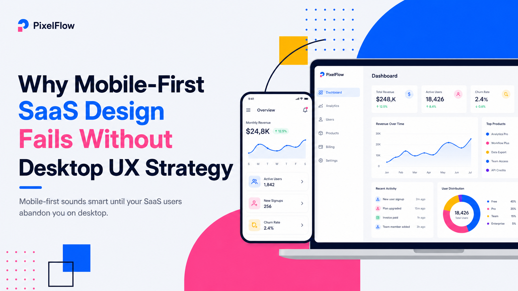
Mobile-first sounds smart until your SaaS users abandon you on desktop.
The conventional wisdom in SaaS product design has shifted toward mobile-first development: design for small screens, then scale up. For consumer apps like Instagram or Uber, this makes sense. For SaaS platforms, it's often backwards—and it costs founders money in churn, poor retention, and costly redesigns.
The core tension: most SaaS products are used primarily on desktop for real work, but designed as if mobile matters equally. The result is interfaces optimized for thumbs, with navigation patterns that confuse keyboard users, information architecture flattened for mobile sidebars, and workflows that feel cramped when users actually sit down to do their job on a 27-inch monitor.
The Real Desktop-vs.-Mobile Split in SaaS
Your actual usage pattern depends on the job your product does, not marketing ideology. Early-stage SaaS founders need to measure—not assume—where users spend time.
Products where desktop dominates work:
- Data-heavy dashboards — analytics, project management, CRM. Users need side-by-side comparison, scrolling through rows and columns, and contextual controls within arm's reach.
- Content creation — writing, design, code. Precision input and screen real estate are non-negotiable.
- Workflow orchestration — incident response, compliance, approvals. Complex branching and audit trails live on desktop.
Products where mobile is secondary but essential:
- Notifications and status checks — monitoring alerts while away, approving quick decisions, checking Slack-like updates.
- Field work — inspections, time tracking, form capture. Here, mobile is primary, but it's still specialized work, not casual use.
The mistake: treating all SaaS as if mobile is a first-class citizen. It's not. Mobile should be complementary to desktop work—a way for users to stay informed or handle urgent items, not a replacement for the full interface.
How Mobile-First Design Breaks Desktop Workflows
When you design for a 375px viewport first, then expand to 1920px, you inherit problems at every stage:
Navigation becomes buried or oversimplified
Mobile-first designs often hide navigation in hamburger menus to save space. On desktop, this creates unnecessary friction—users can't see the information architecture at a glance. Productive teams need to jump between modules fast. Figma, Notion, and Linear all keep primary navigation visible on desktop; they don't hide it in a drawer.
Information architecture flattens for mobile scrolling
Mobile screens demand vertical scrolling. So mobile-first designs often collapse hierarchies: instead of nested, scannable lists, everything becomes a long scroll. Desktop users lose the ability to parse related items in parallel. You end up with a design that feels slow on desktop even though bandwidth and CPU are abundant.
Input methods collide
Mobile design assumes touch: large buttons, tap targets, swiping. Desktop users expect keyboard shortcuts, right-click context menus, and drag-to-reorder. Mobile-first designs often omit these because they're not "required" on mobile. Then desktop power users complain the product feels slow, and they switch to a competitor that respects their workflow.
Affordances disappear at scale
Mobile-first interfaces flatten visual hierarchy to reduce clutter. On desktop with more space, that same flattened hierarchy makes important controls hard to find. A dashboard designed mobile-first might have every button the same size and weight; scaled to desktop, it looks chaotic instead of calm.
The Right Way: Desktop-Primary with Mobile Complement
For most SaaS products, the design strategy should invert: design the full, powerful desktop experience first, then thoughtfully extract a mobile complement.
1. Define the core job on desktop
Map the workflows that actually drive user value. For a project management tool, that's: create tasks, assign, track status, collaborate. For a CRM, it's: prospect pipeline, outreach, deal progression. Map these as flows on desktop with full information density and power-user shortcuts.
2. Identify what mobile adds, not what it replaces
Mobile shouldn't replicate the desktop interface at smaller scale. Instead, ask: what does a user do on mobile that desktop can't? Approve a decision while commuting. Check a notification. Capture a quick note. Mark a task done. These are different jobs than the primary work—and they should have different interfaces optimized for those specific jobs.
3. Use responsive design to adapt, not to shrink
True responsive design is not the same as mobile-first. It means the interface adapts to the viewport and input method—but the core structure and logic live in the primary context (desktop). Buttons can grow on mobile without losing hierarchy. Navigation can hide on mobile if necessary, but stay visible and full on desktop. Tables can scroll horizontally on mobile instead of collapsing into unreadable stacks.
4. Invest in keyboard and accessibility on desktop
Desktop users work fast. They expect Tab navigation, Command/Ctrl shortcuts, and predictable focus management. If your product is only designed for clicks and touch, desktop power users will feel the friction and leave. The Small Square's approach to SaaS design prioritizes keyboard workflows and accessibility-aware UI foundations precisely because these drive retention and user satisfaction at scale.
Real Product Evidence
Look at how the best SaaS platforms handle this. Figma's desktop experience is dense, keyboard-rich, and full of options. The mobile app exists but doesn't pretend to be the full tool—it's for viewing and commenting. Linear's web app on desktop shows a full sidebar, inline editing, and complex filters; on mobile, it shows a simplified agenda and mobile-specific quick actions. Neither was designed mobile-first and scaled; both were designed desktop-first with mobile as a secondary, purposeful layer.
If you're building SaaS and your design process started with "mobile first," revisit your product specification. Measure where users actually spend time. If 80% of usage is desktop, why does your design process spend 50% of energy on mobile constraints? That's a sign your priorities are inverted.
When Mobile-First Actually Works
There are genuine exceptions. If your SaaS is for field teams—inspectors, service techs, field surveyors—mobile is primary. But even then, the backend, reporting, and management interface live on desktop. You still need desktop-primary design for the full product; mobile is just the on-site tool.
The rule: Desktop-primary design with mobile as a complementary layer is the right structure for the vast majority of SaaS products, especially complex workflows, dashboards, and collaboration tools.
When you start there, your product feels fast, professional, and respectful of how teams actually work. When you start with mobile-first, you end up rebuilding for desktop later—wasting time and money that could have shipped features.
How to Fix a Mobile-First Design
If you're already live with a mobile-first SaaS product, you don't need a complete rebuild. But you do need a strategic redesign that prioritizes desktop workflows:
- Restore full navigation visibility on desktop breakpoints.
- Rebuild information architecture to show hierarchy and relationships in parallel, not just vertically.
- Add keyboard shortcuts and accessibility-first interaction patterns.
- Design mobile screens as focused views of specific jobs, not scaled-down desktops.
- Test with real users on desktop—not just mobile.
This is where specialized SaaS design expertise matters. Platforms like The Small Square focus specifically on product design for early-stage SaaS and understand these platform-specific tradeoffs. Their approach to UX/UI design for multi-role dashboards and workflows starts with desktop as the primary canvas, then optimizes mobile deliberately—not by accident.
If you're starting a new SaaS product or inheriting one with muddled design priorities, the fastest path forward is to clarify: where do your users spend the most time and do the highest-value work? Design there first. Mobile follows.
For early-stage SaaS founders who need help translating this strategy into actual product design, consider working with a team experienced in SaaS workflows. A skilled SaaS product design agency can audit your existing product, identify which interfaces are desktop-primary and which are misaligned, and execute a phased redesign that prioritizes the jobs that drive retention and revenue.
Whether you're choosing between custom Framer website development for your marketing site, Webflow development agency services for landing pages, or full-scale SaaS development services for your product, the design foundation should always start with your users' primary workflow—and for SaaS, that's almost always desktop.


Accepted Payments


