Why Your SaaS Product Looks Good But Doesn't Convert: The Design-to-Revenue Gap
The Design That Impresses Nobody (Literally)
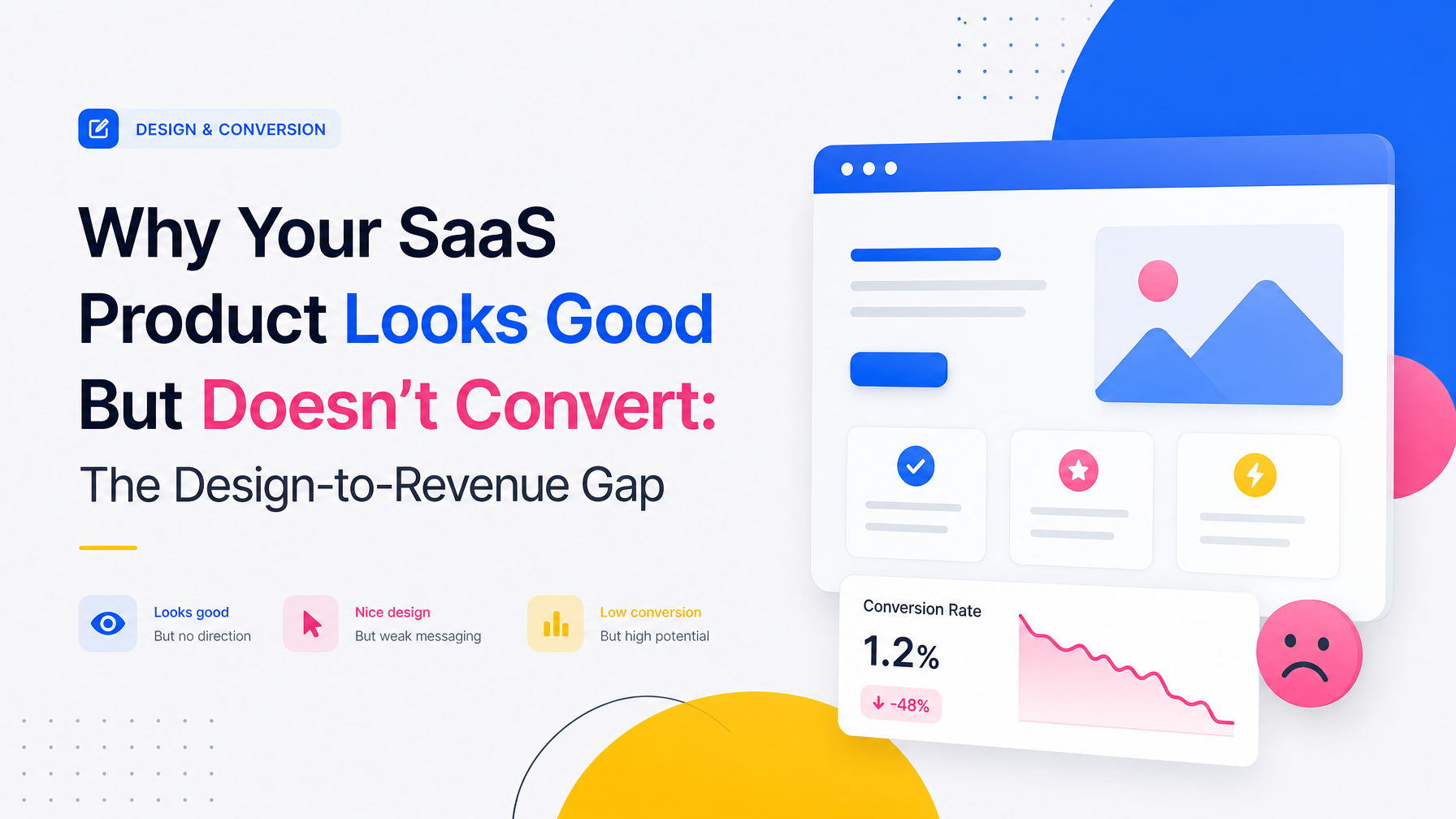
Your landing page passed three design reviews. The color palette is cohesive. The typography is clean. The spacing is mathematically perfect. And it's converting at 1.2%.
This is the most common problem early-stage SaaS founders bring to product design agencies: a product that looks competent but feels sterile, impressive on a portfolio but invisible in market. The gap between beautiful design and profitable design is where most bootstrapped and pre-Series A founders lose months and runway.
Beautiful design and conversion-focused design require different methodologies. One optimizes for aesthetics; the other optimizes for decision-making. Most agencies default to the first. The Small Square builds for the second—because a product that sells itself isn't one that wins design awards. It's one that removes friction from the path to "yes."
Why Aesthetics and Conversions Pull in Opposite Directions
A designer trained in visual hierarchy, color theory, and compositional balance is solving a different problem than a designer trained in behavioral economics and decision-making patterns. Both skills look like "good design," but they optimize for different outcomes.
Aesthetic design says: "This is beautiful, and beautiful things signal quality." It's not wrong. But it's incomplete.
Conversion design says: "What cognition does a human need to perform to become a customer, and what visual pattern removes the most friction from that cognition?" It's opinionated about whitespace because whitespace that looks elegant can also confuse the eye about what to click. It's opinionated about color because a brand color that looks premium might have 3.2:1 contrast and fail WCAG standards—which means 15% of your audience can't see the CTA clearly. It's opinionated about copy placement because you've tested where users actually read versus where you assume they do.
Here's the mechanism: your brain processes information in predictable patterns. F-pattern scanning for lists. Z-pattern for single-column layouts. Gaze direction follows faces, arrows, and pointed objects. Cognitive load increases with every additional decision. Friction multiplies with each form field. When a designer ignores these patterns in pursuit of visual novelty, they're literally working against human neurology.
The Specific Moments Where Aesthetic Design Kills Conversions
1. Visual Hierarchy That Doesn't Match Decision Hierarchy
Your hero section has a stunning 40-word value prop in elegant sans-serif. Below it, in half-size type, is your CTA button. The eye lands on the copy (because it's bigger), reads it, gets inspired—and then has to hunt for what to click next. Conversion design would invert this: the CTA is the largest, most contrasty element. The copy supports the decision, not the other way around.
2. Whitespace That Creates Cognitive Gaps
Designers love whitespace. It signals luxury and clarity. But excessive whitespace between a headline and its supporting copy can break the cognitive connection between them. A user scrolls, sees the headline, scrolls again, and by the time they see the subheading, they've already forgotten what problem the headline solved. Conversion design keeps related information within the same viewport and same visual proximity.
3. Color Choices That Look Premium but Confuse the Eye
A muted sage green button on a soft beige background is sophisticated. It's also invisible to 8% of your users with color blindness and indistinguishable from the background to users scanning quickly on mobile. Conversion design sacrifices some visual refinement for clarity: high contrast, accessible color pairs, and CTAs that interrupt the visual flow intentionally.
4. Symmetry That Signals "This Isn't for Me"
Perfect bilateral symmetry looks balanced and formal—which is why it's the default for corporate sites and luxury brands. For SaaS, especially for developer tools and internal platforms, symmetry can feel distant or institutional. Asymmetrical layouts signal movement, energy, and friendliness. Conversion design breaks symmetry when the audience would read "stiff" and "corporate" as friction.
How Conversion Design Actually Works: Three Mechanics
Remove Friction From the Critical Path
Map every decision a user must make to become a customer. Not "understand your value"—that's a benefit, not a decision. The actual decisions: "Is this worth my time?" "Can I afford it?" "Can I trust this team?" "Will this work with my stack?" Each decision is a potential exit. Conversion design removes visual and cognitive noise from these moments and amplifies the information that answers them.
Use Contrast to Create Intention
Contrast is how the eye knows what matters. High contrast on your CTA tells the user this is the point of the page. Breaking contrast elsewhere (softer colors, smaller type) tells the user "this is supporting information." Conversion design is intentional about where contrast lives and never wastes it on decorative elements.
Test Against Baseline Assumptions
Aesthetic design is guided by taste and trend. Conversion design is guided by data. You assume users read long-form copy about your mission, but heatmaps show they skip to pricing. You assume the three-column feature list is clear, but scroll depth shows users stop at the first column. You assume your value prop is obvious, but session recordings show users leaving confused. Conversion design starts with assumptions but doesn't end there.
When You Need Both: The Actual Answer
This isn't an argument for ugly conversions. The companies that convert best—Stripe, Intercom, Slack's early site—are also beautiful. They're just beautiful in service of something: clarity, action, movement toward a decision. Their aesthetics aren't arbitrary.
The question isn't "aesthetics or conversion." It's "aesthetics in service of what?" If the answer is "in service of visual harmony," you've got a portfolio piece. If the answer is "in service of decision-making," you've got a product that sells itself.
Early-stage SaaS founders usually have one constraint: time. You can't afford months of iterative testing and refinement. You need a design system that bakes conversion methodology into the foundation—not as an afterthought. This means starting with user research into how your specific buyer makes decisions (not generic conversion best practices), mapping their critical moments, and designing every pixel in service of those moments.
How to Audit Your Current Design for the Gap
If you have live traffic, pull these numbers:
- Where do users click first? Heatmaps show attention. If they're clicking on your logo or a non-interactive element, your visual hierarchy is signaling the wrong thing.
- Where do users exit? Session recordings show the exact moment interest becomes friction. It's usually one of the decision moments above.
- Do users match your audience assumption? If your ICP is "DevOps engineers" but 60% of your traffic is finance people, your design is solving for the wrong buyer.
- How far do users scroll? If 40% bounce before they see pricing, your value prop didn't land by the fold.
These metrics separate "objectively well-designed" from "designed to move your specific buyer toward a decision."
Why Agencies Miss This (And How The Small Square Doesn't)
Most design agencies are trained in design school—visual communication, composition, aesthetics. Few are trained in behavioral economics, decision psychology, or product analytics. Fewer still have shipped products themselves and seen the gap between "shipped" and "profitable."
The Small Square builds SaaS products, not portfolio pieces. We've earned $1.8M+ on Upwork by delivering products founders can actually sell. That means understanding not just what looks good, but what moves early-stage buyers from curiosity to payment. Our team has shaped products like Mattermost (first designer, PACE Award) and Focalboard (UX/UI lead, Product Hunt recognition)—shipped products with real revenue and real users. When we design your SaaS landing page or product interface, we're not guessing what converts. We're applying the same methodology we've tested across dozens of founder-facing products.
If your current design is beautiful but your metrics are flat, the problem isn't that it's too aesthetic. It's that it was optimized for one thing and you need it optimized for another. That gap is fixable—but only if you recognize it as a gap, not a feature.
Ready to move beyond beautiful design into design that ships? Explore SaaS development services that combine conversion strategy with product building, or dive into our webflow development agency approach if you're building a landing page or marketing site. For founders building interactive products, our custom Framer website development offers design-first prototyping that puts conversion decisions into the hands of your team before a single line of code.


Accepted Payments


